[**Advisory boards aren’t only for executives. Join the LogRocket Content Advisory Board today →**](https://lp.logrocket.com/blg/content-advisory-board-signup)
[](https://logrocket.com/)
2026-03-02
3006
#react
Amazing Enyichi Agu
192451
116

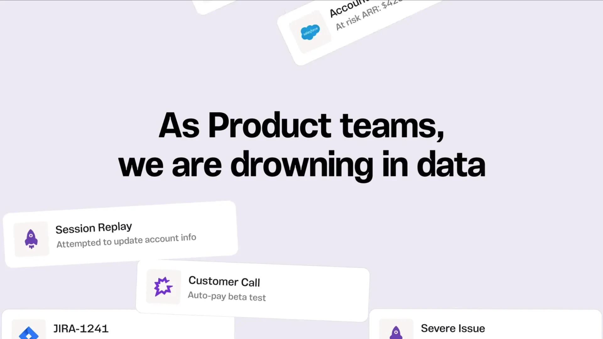
## See how LogRocket's Galileo AI surfaces the most severe issues for you
### No signup required
Check it out
Galileo AI Overview - May 2025
1:15
Click for sound
_**Editor’s note:** This post was updated in March 2026 by [Elijah Asoula](https://blog.logrocket.com/author/asaoluelijah/) to include Base UI and add updated examples and use cases to make the comparison more actionable._

Using React component libraries is a popular way to quickly build React applications. Components from these libraries offer several advantages. First, they follow accessibility guidelines such as [WAI-ARIA](https://www.w3.org/WAI/standards-guidelines/aria/), ensuring that applications are usable by everyone. Second, they come with built-in styling and design so developers can focus on other aspects of their applications. Third, many include pre-defined behaviors — for example, an autocomplete component that filters options based on user input — which saves time and effort compared to building from scratch.
React component libraries are also typically optimized for performance. Because they are maintained by large communities or organizations, they receive regular updates and follow efficient coding practices. Examples include [Material UI](https://blog.logrocket.com/guide-material-design-react/), [Chakra UI](https://blog.logrocket.com/chakra-ui-adoption-guide/), and [React Bootstrap](https://www.youtube.com/watch?v=NlZUtfNVAkI).
However, these libraries leave limited room for customization. You can usually tweak styles, but you cannot fundamentally change the underlying design system. A developer may want the accessibility and functionality benefits of a component library while still implementing a completely custom design system.
Headless (unstyled) component libraries were created to fill this gap. A headless component library provides fully functional components without imposing styling. With headless components, developers are responsible for styling them however they see fit.
Tailwind Labs’ [Headless UI](https://headlessui.com/) is one of the most popular headless libraries in the React ecosystem. While it works well for many projects, it is not always the best choice for every use case. This article explores several alternatives for unstyled components, including Radix Primitives, React Aria, Ark UI, and Base UI.
### 🚀 Sign up for The Replay newsletter
[**The Replay**](https://blog.logrocket.com/the-replay-archive/) is a weekly newsletter for dev and engineering leaders.
Delivered once a week, it's your curated guide to the most important conversations around frontend dev, emerging AI tools, and the state of modern software.
Fields marked with an \* are required
Email \*
If you are a human seeing this field, please leave it empty.
## Prerequisites
To follow along with this guide, you should have a basic understanding of HTML, CSS, JavaScript, and React.
## Why not just use Tailwind Labs’ Headless UI library?
Headless UI is an unstyled React component library developed by Tailwind Labs, the creators of Tailwind CSS. The library is designed to integrate particularly well with Tailwind CSS, as noted in its documentation. It is also one of the most widely adopted headless libraries, with around 28K GitHub stars and millions of weekly npm downloads.
However, Headless UI is limited in the number of unstyled components it provides. At the time of writing, it offers 16 primary components. The other libraries covered in this article provide significantly more components for broader use cases. Additionally, some of these alternatives include utility components and helper functions that Headless UI does not offer.
Let’s explore these alternatives.
## Radix Primitives
[Radix Primitives](https://www.radix-ui.com/primitives) is a library of unstyled React components built by the team behind [Radix UI](https://radix-ui.com/), a UI library with fully styled and customizable components. According to its website, the Node.js, Vercel, and Supabase teams use Radix Primitives. The project has approximately 18K stars on [GitHub](https://github.com/radix-ui/primitives).
You can [style Radix Primitives components](https://blog.logrocket.com/radix-ui-adoption-guide/#:~:text=you%20should%20know.-,Radix%20Primitives,-Radix%20Primitives%20is) using any styling solution, including CSS, Tailwind CSS, or CSS-in-JS. The components also support server-side rendering. Radix provides comprehensive documentation for each primitive, explaining usage patterns and composition strategies.
### Installing and using Radix Primitives
The following steps demonstrate how to install and use Radix Primitives. In this example, we’ll import a dialog component and style it using vanilla CSS.
First, [create a React project](https://react.dev/learn/creating-a-react-app) using your preferred framework, or open an existing project.
Next, install the Radix primitive you need. Radix publishes each component as a separate package. For this example, install the `Dialog` component:
```bash
npm install @radix-ui/react-dialog
```
Now, create a file to import and customize the unstyled component:
```javascript
// RadixDialog.jsx
import * as Dialog from '@radix-ui/react-dialog';
import './radix.style.css';
function RadixDialog() {
return (
Radix Dialog
Confirm Deletion
Are you sure you want to permanently delete this file?
CancelDelete Forever
);
}
export default RadixDialog;
```
Next, add styling:
```css
/* radix.style.css */
.btn {
padding: 0.5rem 1.2rem;
border-radius: 0.2rem;
border: none;
cursor: pointer;
}
.primary-btn {
background-color: #1e64e7;
color: white;
box-shadow: rgba(0, 0, 0, 0.2) 0px 2px 10px;
}
.red-btn {
background-color: #d32f2f;
color: #ffffff;
box-shadow: rgba(0, 0, 0, 0.2) 0px 2px 10px;
}
.dialog-overlay {
background-color: rgba(0, 0, 0, 0.4);
position: fixed;
inset: 0;
animation: overlayAnimation 200ms cubic-bezier(0.19, 1, 0.22, 1);
}
.dialog-content {
background-color: white;
position: fixed;
border-radius: 0.2rem;
top: 50%;
left: 50%;
translate: -50% -50%;
width: 90vw;
max-width: 450px;
padding: 2.5rem;
box-shadow: rgba(50, 50, 93, 0.25) 0px 2px 5px -1px,
rgba(0, 0, 0, 0.3) 0px 1px 3px -1px;
}
.dialog-title {
font-size: 1.1rem;
padding-bottom: 0.5rem;
border-bottom: 3px solid #dfdddd;
margin-bottom: 1rem;
}
.dialog-body {
margin-bottom: 3rem;
}
.bottom-btns {
display: flex;
justify-content: flex-end;
}
.bottom-btns .btn:last-child {
display: inline-block;
margin-left: 1rem;
}
@keyframes overlayAnimation {
from {
opacity: 0;
}
to {
opacity: 1;
}
}
```
Finally, export and render the component in the DOM.
Here is the UI demo of the dialog component we styled above:
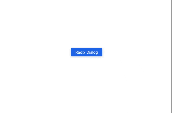Dialog box built using Radix Primitives styled with custom CSS
### Radix Primitives pros and cons
Like every headless library covered in this guide, Radix Primitives has both advantages and tradeoffs.
**Pros**
* * *
[\\
\\
**Over 200k developers use LogRocket to create better digital experiences** \\
\\
Learn more →](https://lp.logrocket.com/blg/learn-more)
* * *
- It offers 28 main components, significantly more than Headless UI.
- You can install components individually, allowing incremental adoption.
- It provides an `asChild` prop that lets developers change the default DOM element of a Radix component — a pattern known as [composition](https://www.radix-ui.com/primitives/docs/guides/composition).
**Cons**
- Installing multiple components individually can feel repetitive.
- The anatomy-based structure of components can take time to understand.
## React Aria
[React Aria](https://react-spectrum.adobe.com/react-aria/index.html) is a library of unstyled components released by Adobe as part of its React UI collection, [React Spectrum](https://github.com/adobe/react-spectrum). While Adobe does not maintain a separate repository exclusively for React Aria, the React Spectrum repository has over 14K GitHub stars at the time of writing. Its npm package, `react-aria-components`, receives thousands of weekly downloads.
React Aria allows developers to style components using any preferred styling method. It also supports incremental adoption through [React Aria hooks](https://react-spectrum.adobe.com/react-aria/hooks.html), enabling fine-grained control over component behavior.
### Installing and using React Aria
In this example, we’ll build another dialog box using React Aria, styled similarly to the Radix example.
First, create a new React application or open an existing project. Then install the component package:
```bash
npm install react-aria-components
```
Next, import the required components to construct a dialog:
```javascript
// AriaDialog.jsx
import {
Button,
Dialog,
DialogTrigger,
Heading,
Modal,
ModalOverlay
} from 'react-aria-components';
import './aria.style.css';
function AriaDialog() {
return (
);
}
export default AriaDialog;
```
Now, add styling. React Aria provides built-in class names such as `.react-aria-Button`, which you can use directly in CSS. You can also override them with custom classes like `.btn` in this example:
```css
/* aria.style.css */
.btn {
padding: 0.5rem 1.2rem;
border-radius: 0.2rem;
border: none;
cursor: pointer;
}
.primary-btn {
background-color: #1e64e7;
color: white;
box-shadow: rgba(0, 0, 0, 0.2) 0px 2px 10px;
}
.red-btn {
background-color: #d32f2f;
color: #ffffff;
box-shadow: rgba(0, 0, 0, 0.2) 0px 2px 10px;
}
.react-aria-ModalOverlay {
background-color: rgba(0, 0, 0, 0.4);
position: fixed;
inset: 0;
animation: overlayAnimation 200ms cubic-bezier(0.19, 1, 0.22, 1);
display: flex;
justify-content: center;
align-items: center;
}
.react-aria-Dialog {
background-color: white;
border-radius: 0.2rem;
width: 90vw;
max-width: 450px;
padding: 2.5rem;
box-shadow: rgba(50, 50, 93, 0.25) 0px 2px 5px -1px,
rgba(0, 0, 0, 0.3) 0px 1px 3px -1px;
outline: none;
}
.react-aria-Dialog .react-aria-Heading {
font-size: 1.1rem;
padding-bottom: 0.5rem;
border-bottom: 3px solid #dfdddd;
margin-bottom: 1rem;
}
.dialog-body {
margin-bottom: 3rem;
}
.bottom-btns {
display: flex;
justify-content: flex-end;
}
.bottom-btns .btn:last-child {
display: inline-block;
margin-left: 1rem;
}
@keyframes overlayAnimation {
from {
opacity: 0;
}
to {
opacity: 1;
}
}
```
Finally, export and render the component in the DOM.
Here is the output of the dialog box in this example:
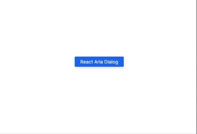Dialog component built using React Aria styled with custom CSS
### React Aria pros and cons
**Pros**
- It offers hooks for individual components, which support incremental adoption.
- It provides 43 main components.
- All components include built-in class names, simplifying styling.
**Cons**
- Some components require more setup. For example, the dialog required destructuring the `close` function and explicitly wiring it to buttons.
- Components often need to be combined to function fully. In this example, we used `Button`, `Dialog`, `DialogTrigger`, `Heading`, `Modal`, and `ModalOverlay` together to build a dialog. This structure can feel complex at first.
## Ark UI
[Ark UI](https://ark-ui.com/) is a library of unstyled components that work across React, Vue, and Solid. It is developed by Chakra Systems, the team behind Chakra UI. The project has gained steady adoption, with around 4.9K stars on [GitHub](https://github.com/chakra-ui/ark) and thousands of weekly npm downloads.
Like Radix Primitives and React Aria, Ark UI allows you to style headless components using any method you prefer, including CSS, Tailwind CSS, Panda CSS, or Styled Components. One of its distinguishing features is multi-framework support.
### Installing and using Ark UI
In this example, we’ll build another dialog box using Ark UI and style it with vanilla CSS.
First, create a new React project or open an existing one. Then install Ark UI for React:
```bash
npm install @ark-ui/react
```
Next, import and use the unstyled components. Below is the anatomy of a dialog in Ark UI:
```javascript
// ArkDialog.jsx
import { Dialog, Portal } from '@ark-ui/react';
import './ark.style.css';
function ArkDialog() {
return (
Ark UI Dialog
Confirm Deletion
Are you sure you want to permanently delete this file?
Cancel
Delete Forever
);
}
export default ArkDialog;
```
Now, style the component using your preferred method. Here is a vanilla CSS example:
```css
/* ark.style.css */
.btn {
padding: 0.5rem 1.2rem;
border-radius: 0.2rem;
border: none;
cursor: pointer;
}
.primary-btn {
background-color: #1e64e7;
color: white;
box-shadow: rgba(0, 0, 0, 0.2) 0px 2px 10px;
}
.red-btn {
background-color: #d32f2f;
color: #ffffff;
box-shadow: rgba(0, 0, 0, 0.2) 0px 2px 10px;
}
[data-scope="dialog"][data-part="backdrop"] {
background-color: rgba(0, 0, 0, 0.4);
position: fixed;
inset: 0;
animation: backdropAnimation 200ms cubic-bezier(0.19, 1, 0.22, 1);
}
[data-scope="dialog"][data-part="positioner"] {
position: fixed;
top: 50%;
left: 50%;
translate: -50% -50%;
width: 90vw;
max-width: 450px;
}
[data-scope="dialog"][data-part="content"] {
background-color: white;
padding: 2.5rem;
border-radius: 0.2rem;
box-shadow: rgba(50, 50, 93, 0.25) 0px 2px 5px -1px,
rgba(0, 0, 0, 0.3) 0px 1px 3px -1px;
}
[data-scope="dialog"][data-part="title"] {
font-size: 1.1rem;
padding-bottom: 0.5rem;
border-bottom: 3px solid #dfdddd;
margin-bottom: 1rem;
}
[data-scope="dialog"][data-part="description"] {
margin-bottom: 3rem;
}
.bottom-btns {
display: flex;
justify-content: flex-end;
}
.bottom-btns .btn:last-child {
display: inline-block;
margin-left: 1rem;
}
@keyframes backdropAnimation {
from {
opacity: 0;
}
to {
opacity: 1;
}
}
```
Finally, export and render the component. Below is the output of the example:
Dialog component built using Ark UI styled with custom CSS
### Ark UI pros and cons
**Pros**
- It provides 34 main components.
- It includes advanced components such as a carousel and circular progress bar, which can be complex to implement from scratch.
- It supports [component composition](https://ark-ui.com/react/docs/guides/composition) using the `asChild` prop, similar to Radix Primitives.
**Cons**
- It does not provide built-in class names like React Aria.
- The recommended styling approach relies on `data-scope` and `data-part` attributes, which may feel unfamiliar at first.
For example, styling a specific part of the dialog can look like this:
```css
[data-scope="dialog"][data-part="positioner"] {
position: fixed;
top: 50%;
left: 50%;
translate: -50% -50%;
width: 90vw;
max-width: 450px;
}
```
Developers who prefer a more familiar workflow can assign custom class names using `className` and target those instead:
```css
.primary-btn {
background-color: #1e64e7;
color: white;
box-shadow: rgba(0, 0, 0, 0.2) 0px 2px 10px;
}
```
This approach preserves Ark UI’s headless behavior while allowing conventional CSS styling.
## Base UI
[Base UI](https://base-ui.com/) is a library of unstyled React components built by contributors from Radix, Floating UI, and the Material UI team. While it follows the same headless philosophy as the other libraries discussed in this article, Base UI places a stronger emphasis on stable APIs that are well-suited for building long-term custom design systems. At the time of writing, Base UI has more than 8.1K stars on its [GitHub repository](https://github.com/mui/base-ui) and is actively maintained with regular releases.
Like the other headless libraries in this guide, Base UI components can be styled using CSS, Tailwind CSS, or CSS-in-JS. The documentation also includes guidance on advanced patterns such as controlled dialogs and detached triggers.
### Installing and using Base UI
Unlike Radix Primitives, which publishes each component separately, Base UI ships all components in a single tree-shakable package. This makes installation straightforward.
First, create a new React project or open an existing one. Then install Base UI:
```bash
npm i @base-ui/react
```
Next, create a file and import the `Dialog` component. In this example, we’ll build another dialog box:
```javascript
// BaseDialog.jsx
import { Dialog } from '@base-ui/react/dialog';
import './base.style.css';
function BaseDialog() {
return (
Base UI Dialog
Confirm Deletion
Are you sure you want to permanently delete this file?
Cancel
Delete Forever
);
}
export default BaseDialog;
```
Now, add styling:
```css
/* base.style.css */
.btn {
padding: 0.5rem 1.2rem;
border-radius: 0.2rem;
border: none;
cursor: pointer;
}
.primary-btn {
background-color: #1e64e7;
color: white;
box-shadow: rgba(0, 0, 0, 0.2) 0px 2px 10px;
}
.red-btn {
background-color: #d32f2f;
color: #ffffff;
box-shadow: rgba(0, 0, 0, 0.2) 0px 2px 10px;
}
.dialog-overlay {
background-color: rgba(0, 0, 0, 0.4);
position: fixed;
inset: 0;
animation: overlayAnimation 200ms cubic-bezier(0.19, 1, 0.22, 1);
}
.dialog-content {
background-color: white;
position: fixed;
border-radius: 0.2rem;
top: 50%;
left: 50%;
translate: -50% -50%;
width: 90vw;
max-width: 450px;
padding: 2.5rem;
box-shadow: rgba(50, 50, 93, 0.25) 0px 2px 5px -1px,
rgba(0, 0, 0, 0.3) 0px 1px 3px -1px;
}
.dialog-title {
font-size: 1.1rem;
padding-bottom: 0.5rem;
border-bottom: 3px solid #dfdddd;
margin-bottom: 1rem;
}
.dialog-body {
margin-bottom: 3rem;
}
.bottom-btns {
display: flex;
justify-content: flex-end;
}
.bottom-btns .btn:last-child {
display: inline-block;
margin-left: 1rem;
}
@keyframes overlayAnimation {
from {
opacity: 0;
}
to {
opacity: 1;
}
}
```
Finally, import and render the component in your application:
* * *
The Best of React on PodRocket - Emily Kochanek \| Spotify
[Play on Spotify](https://open.spotify.com/playlist/4j70ZVQNj5Lk3gtyCG5VWk?go=1&sp_cid=9b33d2eacd138b2cca505c1298fc4c90&utm_source=embed_player_p&utm_medium=desktop "Play on Spotify")
# [The Best of React on PodRocket](https://open.spotify.com/playlist/4j70ZVQNj5Lk3gtyCG5VWk?go=1&sp_cid=9b33d2eacd138b2cca505c1298fc4c90&utm_source=embed_player_p&utm_medium=desktop)
PreviewE
## [Emily Kochanek](https://open.spotify.com/playlist/4j70ZVQNj5Lk3gtyCG5VWk?go=1&sp_cid=9b33d2eacd138b2cca505c1298fc4c90&utm_source=embed_player_p&utm_medium=desktop)
Save on Spotify
01. 1
### The React Core team talks React Forget and the future
#### PodRocket
40:49
02. 2
### Why I still choose React with Chance Strickland
#### PodRocket
36:03
03. 3
### The future of React with Theo Browne
#### PodRocket
31:32
04. 4
### Should you use React in 2023? with Tru Narla
#### PodRocket
27:01
05. 5
### Your React questions answered
#### PodRocket
39:01
06. 6
### React and frontend development with Josh Comeau
#### PodRocket
23:32
07. 7
### Tom Preston-Werner talks React Server Components and the future of RedwoodJS
#### PodRocket
40:19
08. 8
### How React 18 improves application performance with Lydia Hallie
#### PodRocket
27:14
09. 9
### SolidJS for React developers with Erik Rasmussen
#### PodRocket
36:59
10. 10
### Understanding React's Fiber architecture with Tejas Kumar
#### PodRocket
25:01
11. 11
### React concurrency with Ivan Akulov
#### PodRocket
35:24
12. 12
### Next-generation React architectures with Mikael Brevik
#### PodRocket
38:52
13. 13
### React Server Components with Sanket Sahu
#### PodRocket
25:17
14. 14
### Stack Overflow survey, React Server Components, and Google Domains
#### PodRocket
37:20
15. 15
### Speed up React apps with less JavaScript with Miško Hevery
#### PodRocket
24:56
16. 16
### React, TypeScript, and ESLint with Josh Goldberg
#### PodRocket
30:10
17. 17
### Node 20, React, and AI with Theo Browne, Michael Chan, and Eve Porcello
#### PodRocket
44:29
18. 18
### React's re-rendering with Ankita Kulkarni
#### PodRocket
28:45
19. 19
### React Hooks broke my tests with Daniel Afonso
#### PodRocket
31:30
20. 20
### Deep diving on concurrent React with Matheus Albuquerque
#### PodRocket
38:07
21. 21
### React Compiler with Sathya Gunasekaran and Joe Savona
#### PodRocket
25:43
22. 22
### 50 shades of React rendering in Next.js with Ben Ilegbodu
#### PodRocket
27:04
23. 23
### Mid-year recap, Vercel Ship, and remixing React Router
#### PodRocket
39:40
24. 24
### Visualizing Open Source Data in React with Brian Douglas
#### PodRocket
36:08
25. 25
### Incomplete React with Sam Selikoff
#### PodRocket
32:12
26. 26
### React Components as a service with Steven Fabre
#### PodRocket
26:35
27. 27
### Partial pre-rendering in Next.js with Delba de Oliveira and Wyatt Johnson
#### PodRocket
26:23
28. 28
### Using RSCs in Expo Router with Evan Bacon
#### PodRocket
33:11
29. 29
### Generative UI and React components with Malte Ubl
#### PodRocket
24:57
30. 30
### Web without walls with Dan Abramov
#### PodRocket
27:40
31. 31
### React 19 with Shruti Kapoor
#### PodRocket
30:06
32. 32
### Universal React with Mo Khazali
#### PodRocket
36:09
33. 33
### An App Developer's Guide to React 19 with Michael Chan
#### PodRocket
26:01
34. 34
### Component composition with Dominik Dorfmiester
#### PodRocket
19:03
- [Play on Spotify](https://open.spotify.com/playlist/4j70ZVQNj5Lk3gtyCG5VWk?go=1&sp_cid=9b33d2eacd138b2cca505c1298fc4c90&utm_source=embed_player_p&utm_medium=desktop)
- Save on Spotify
- Copy link
[Privacy Policy](https://www.spotify.com/legal/privacy-policy/)· [Terms & Conditions](https://www.spotify.com/legal)
* * *
```javascript
import './App.css';
import BaseDialog from './BaseDialog';
function App() {
return (
<>
);
}
export default App;
```
And you should see output similar to the example below:
Dialog component built using Base UI styled with custom CSS
### Base UI pros and cons
**Pros**
- It ships as a single tree-shakable package, eliminating the need to install components individually.
- It includes strong documentation and supports advanced patterns such as controlled dialogs and detached triggers.
**Cons**
- Its ecosystem is still growing compared to more established alternatives.
- Because it is unstyled by design, significant styling work is still required to align it with a production design system.
## Comparing the headless component libraries
To provide a clearer overview of how these headless UI libraries compare across API design, styling flexibility, composition model, and intended use cases, the table below highlights the key differences between Radix Primitives, React Aria, Ark UI, and Base UI.
| Dimension | Radix Primitives | React Aria | Ark UI | Base UI |
| --- | --- | --- | --- | --- |
| **Primary goal** | Polished primitives for app UIs | Accessibility-first primitives | Cross-framework state-driven primitives | Foundation for custom design systems |
| **Mental model** | Component anatomy and composition | Hooks with explicit state | State machines and parts | Low-level primitives meant to be wrapped |
| **Typical usage** | Used directly in application code | Composed per component | Assembled from parts | Extended into internal components |
| **Styling approach** | `className`, `asChild` | Built-in classes with overrides | `data-part` / `data-scope` with `className` | `className` and wrapper components |
| **Ease of styling** | Easy and familiar | Easy once conventions are understood | Moderate, unconventional at first | Easy, but assumes design ownership |
| **Composition flexibility** | High | Very high | High | Very high |
| **Accessibility transparency** | Mostly abstracted | Very explicit | Abstracted via state | Abstracted but predictable |
| **Learning curve** | Moderate | Steep | Moderate to steep | Moderate |
| **Best suited for** | Product teams building applications | Accessibility-critical applications | Multi-framework design systems | Teams building custom design systems |
| **Framework support** | React | React | React, Vue, Solid | React |
This comparison demonstrates that while these libraries often provide similar component coverage, they differ significantly in how components are composed, styled, and extended.
Choosing the right headless UI library ultimately depends on your project goals, team preferences, and long-term maintenance strategy. The following quick guide can help narrow down your options:
- **Use Radix Primitives** if you want mature, well-documented components that can be used directly in application code with minimal setup.
- **Use React Aria** if accessibility is a primary concern and you prefer explicit, hook-based control over component behavior.
- **Use Ark UI** if you need headless components that work across multiple frameworks such as React, Vue, and Solid.
- **Use Base UI** if you are building a custom design system and want a flexible, long-term foundation for your own components.
The best choice depends less on feature parity and more on how well a library’s design philosophy aligns with your team’s workflow and architectural goals.
## Conclusion
This guide explored why developers may look beyond Tailwind Labs’ Headless UI library when choosing unstyled component libraries. We examined several strong alternatives, including Radix Primitives, React Aria, Ark UI, and Base UI.
The frontend ecosystem continues to adopt headless UI libraries because many teams want more control over how components behave and how they are styled. Having multiple headless options available is beneficial, as different projects have different architectural and design needs.
## Get set up with LogRocket's modern React error tracking in minutes:
1. Visit [https://logrocket.com/signup/](https://lp.logrocket.com/blg/react-signup-general) to get
an app ID
2. Install LogRocket via npm or script tag. `LogRocket.init()` must be called client-side, not
server-side
- [npm](https://blog.logrocket.com/headless-ui-alternatives/#plug-tab-1)
- [Script tag](https://blog.logrocket.com/headless-ui-alternatives/#plug-tab-2)
```
$ npm i --save logrocket
// Code:
import LogRocket from 'logrocket';
LogRocket.init('app/id');
```
```
// Add to your HTML:
```
3. (Optional) Install plugins for deeper integrations with your stack:
- Redux middleware
- NgRx middleware
- Vuex plugin
[Get started now](https://lp.logrocket.com/blg/react-signup-general)
- [#react](https://blog.logrocket.com/tag/react/)


## Stop guessing about your digital experience with LogRocket
[Get started for free](https://lp.logrocket.com/blg/signup)
#### Recent posts:
[\\
**CRUD REST API with Node.js, Express, and PostgreSQL**](https://blog.logrocket.com/crud-rest-api-node-js-express-postgresql/)
Build a CRUD REST API with Node.js, Express, and PostgreSQL, then modernize it with ES modules, async/await, built-in Express middleware, and safer config handling.
[](https://blog.logrocket.com/author/taniarascia/)[Tania Rascia](https://blog.logrocket.com/author/taniarascia/)
Mar 25, 2026 ⋅ 16 min read
[\\
**The Replay (3/25/26): Senior dev hiring woes, what AI agents miss, and more**](https://blog.logrocket.com/the-replay-3-25-26/)
Discover what’s new in The Replay, LogRocket’s newsletter for dev and engineering leaders, in the March 25th issue.
[](https://blog.logrocket.com/author/matthewmaccormack/)[Matt MacCormack](https://blog.logrocket.com/author/matthewmaccormack/)
Mar 25, 2026 ⋅ 29 sec read
[\\
**The hidden skills gap in senior dev hiring (and how to screen for it)**](https://blog.logrocket.com/the-hidden-skills-gap-in-senior-dev-hiring/)
Discover a practical framework for redesigning your senior developer hiring process to screen for real diagnostic skill.
[](https://blog.logrocket.com/author/emmanueljohn/)[Emmanuel John](https://blog.logrocket.com/author/emmanueljohn/)
Mar 25, 2026 ⋅ 12 min read
[\\
**Does the Speculation Rules API boost web speed? I tested it**](https://blog.logrocket.com/speculation-rules-api-web-speed-test/)
I tested the Speculation Rules API in a real project to see if it actually improves navigation speed. Here’s what worked, what didn’t, and where it’s worth using.
[](https://blog.logrocket.com/author/judemiracle/)[Jude Miracle](https://blog.logrocket.com/author/judemiracle/)
Mar 24, 2026 ⋅ 10 min read
[View all posts](https://blog.logrocket.com/)
#### 2 Replies to "Headless UI alternatives: Radix Primitives vs. React Aria vs. Ark UI vs. Base UI"
1. \> such as Base UI (from the Material UI team)
This is confusing. The link points to “MUI Base”. But this project has a successor now: Base UI, [https://base-ui.com/](https://base-ui.com/).
[Reply](https://blog.logrocket.com/headless-ui-alternatives/#comment-51239)
1. Thanks for noticing this. Should be all set now
[Reply](https://blog.logrocket.com/headless-ui-alternatives/#comment-51257)
### Leave a Reply [Cancel reply](https://blog.logrocket.com/headless-ui-alternatives/\#respond)
Your email address will not be published.Required fields are marked \*
Comment \*
Name \*
Email \*
Website
Save my name, email, and website in this browser for the next time I comment.
Hey there, want to help make our blog better?
YeaNo Thanks
Join LogRocket’s Content Advisory Board. You’ll help inform the type of
content we create and get access to exclusive meetups, social accreditation,
and swag.
[Sign up now](https://lp.logrocket.com/blg/content-advisory-board-signup)